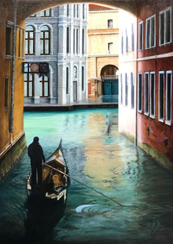
CURRENT PROJECT

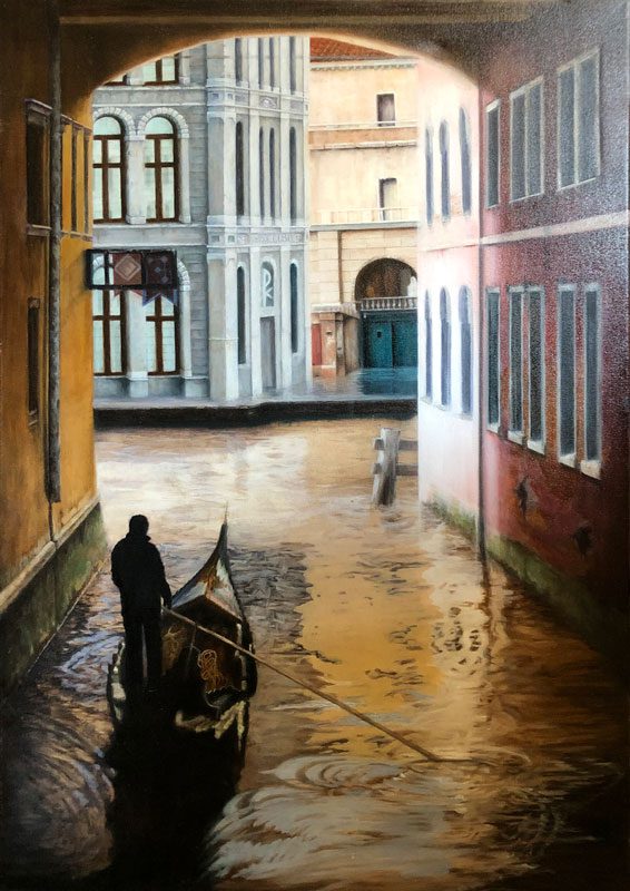
Reticence
36″x24″
Oil on Canvas

OTE_Title-nekkid
2021-HandPaint

PROJECT NOTES:

This project began as an exercise in applying glazes. Glazing is a technique that is most commonly used in portraiture, but can be applied in any situation where you are looking to add depth or “atmosphere” to a painting. With glazing, you will apply numerous combinations of transparent colors to arriver at the final desired color (for example, applying a red glaze over a yellow one results in shades of orange, etc.). It’s a lot like painting with watercolours.

Painter’s Tip: In order to maintain a fat over lean structure, it’s a good idea to mix a few different mediums in progressively thicker batches, to be used in sequence. Example: I mixed 3 mediums for this project; basically #1 for the underpainting, #2 for the glazes, and #3 for the final details and highlights. Any last minute details can be done with straight paint  (no medium).

In the Studio section, I provide a “Recipe” so you can purchase the materials to mix your own mediums if you desire. You can find everything at art supply stores or art supply websites. Amazon carries a ton of different stuff, and if you can get something that has multiple applications you can save a lot of money if it doesn’t say “art” on it. Example: I buy Lavender spike oil on Amazon. Since it can be used for aromatherapy, massage etc, I save a LOT of money compared to art sites. If you do you homework on materials and you’ll get more bang for your buck.

brushwhite-thinH

••• Canvas Preparation •••

brush-white-wideH

01/15/2019

Step 1
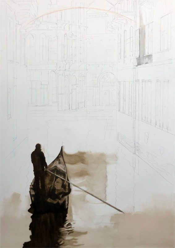
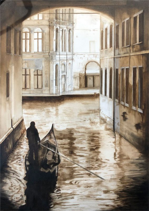
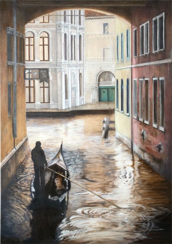
I started by sketching the layout onto the canvas. Since I will be using transparent glazes, I decided to do a monochromatic underpainting. Because the underpainting will show through the glazes, it is important to be detailed in your sketch and carry that through to the underpainting. 

If not for the glazes, a loose “blocked in” underpainting would be fine, because you just use it for reference. However, with the glazes, you need to put more detail in the underpainting because it will be a visible part of the final piece. I am using Raw Sienna with a bit of black and the #1 medium for this.

01/15/2019

Step 2
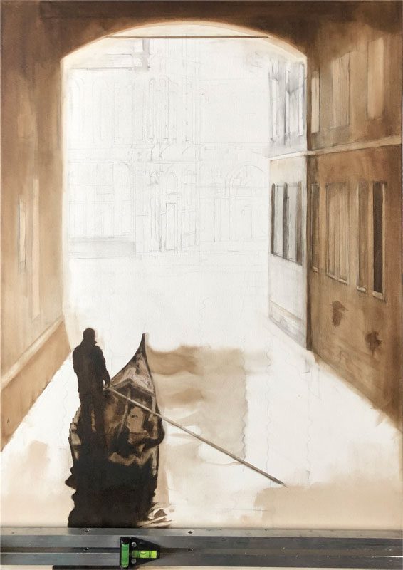
I’m working from foreground to background, so I begin with more detailed brushwork for the boat and the left and right walls. It is very important to get your perspective right in these initial steps form smooth sailing later on. 

01/15/2019

Step 3
Once all the foreground areas are detailed I move to background objects. Making the edges softer here increases the sense of depth. Again, keep the perspective in mind, and stay away from hard lines on background objects.

01/17/2019

Step 4
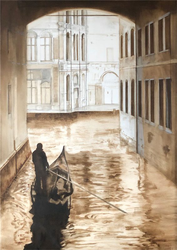
I am pretty much done with the background elements now, so I’m adding details to the water. Since this area transitions all the way from the front to the back, I’ll need to do both detailed and loose work here. Still, I will keep even the most detailed areas of water a bit loose so they don’t detract from the more important foreground elements.

01/19/2019

Step 5
Here is the final underpainting, and the last step using the #1 medium. I gave the overall canvas a couple dark glazes to begin to set the mood. I want the tunnel to be dark in contrast the to sun bleached buildings outside. I also used a bit of burnt sienna in some areas to add a bit of reddish brown. This color will tint the subsequent layers to result in the color I want (you’ll be able to see this later).

brushwhite-thinH

••• Canvas Preparation •••

brush-white-wideH

01/25/2019

Layout
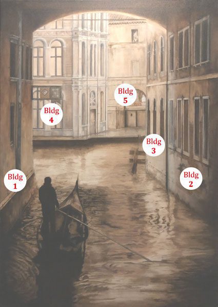
I’ve numbered the buildings here if you want to follow along below.

01/25/2019

Session 1
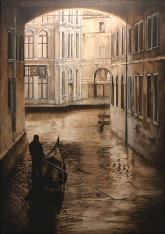
Using the #2 medium now.
 Sorry about the ugly photo, this medium is pretty glossy and there is almost no pigment in these initial glazes, so it’s hard to photograph when wet.

Working from foreground to background, I’ve added the first glaze of yellow to the foreground building on the left (bldg 1)  and the red on the foreground building on the right (bldg 2).

These are very thin glazes, only applied in what will be the darkest areas. Since I will layer the glazes on top of each other, these first areas get darker with each successive layer. There will be a few days between sessions because the glazes have to dry between layers.

I also added some red/orange for the exposed brick areas on bldg 2 as well.

01/28/2019

Session 2
Today I added a second glaze over the yellow wall on bldg 1. I want this building to be a goldenrod color in the end, so I used a touch of burnt sienna in the glaze, which is reddish-brown. 

A second glaze of the same red is applied to the right foreground wall (bldg 2). I also used white to highlight a few areas of both walls.

The intermediate building on the right (bldg 3) gets its first glaze, which is a light shade of yellow. I also added white in the water for its reflection.

Bldg 4 gets a white glaze on the areas that will be highlighted a bit later on.

Finally, bldg 5 gets a light tan glaze on the walls and green on the doors.

02/02/2019

Session 3
I mixed a semi-opaque yellow/white for the bright areas of the wall on bldg 1, and added another transparent yellow glaze on the rest. The final underpainting has some reddish-brown color in these areas so the additional yellow layers are really moving everything toward the goldenrod color I want.

Bldg 2 gets one last red glaze.

Bldg 3 gets an overall white glaze to brighten it up. This building is in full, direct sunlight so it will be almost white when completed.

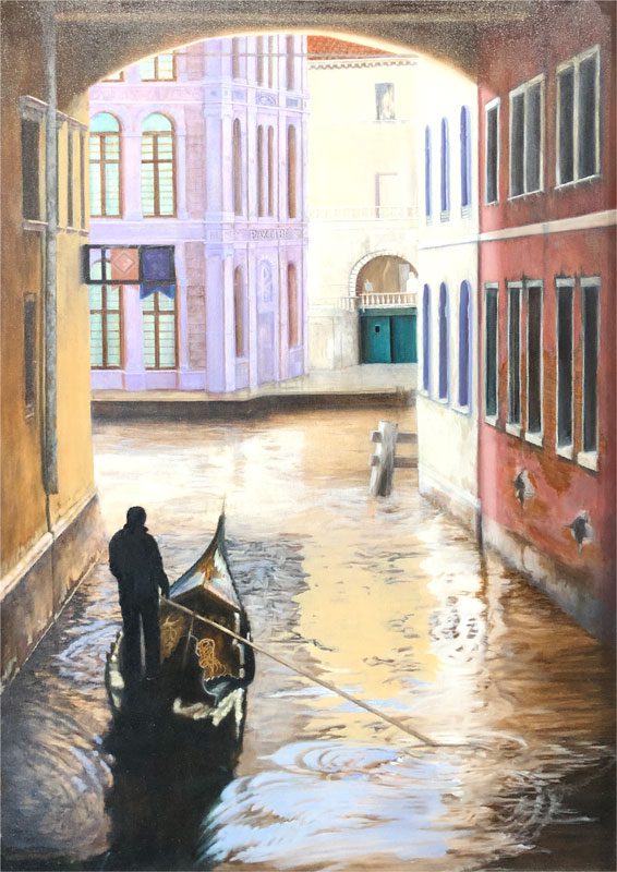
Now, here’s where things start getting a bit wonky. I am using an Alizarin Crimson glaze on bldg 4 to impart a magenta hue, because in the end I want this building to be a particular grey hue (hang with me on this and it will make sense after the next session). I could just paint it grey, but hey man, we’re glazin’ here.

Bldg 5 also gets a thin white glaze to soften all the edges and fade everything a bit. The green doors get a blue glaze to create the blue-green I want to finish with. Remember, with glazes you build the final colors on the canvas, rather than on your palette, and you do its through overlaying the transparent colors that make up the color you want.

02/07/2019

Session 4
This is the final step using the #2 Medium
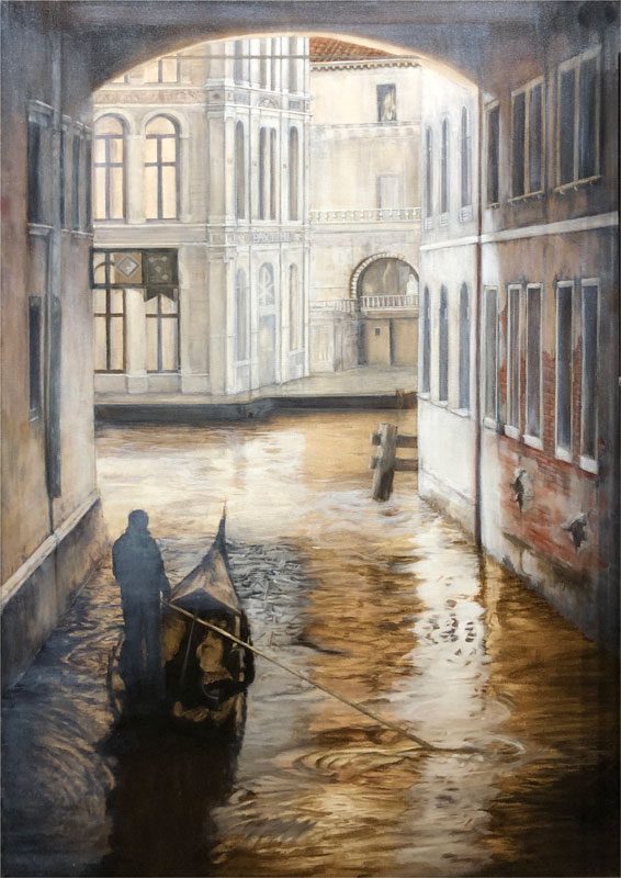
Bldg 1 gets another overall yellow glaze with just a wisp of burnt sienna, and then it gets a black glaze to start darkening everything in the tunnel. Bldg 2 gets a black glaze as well.

Bldgs 1, 2 & 3 get some opaque green down by the waterline for the moss.

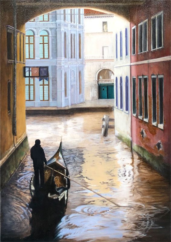
Bldg 4 – I glazed over that frightening pink color with a green glaze to shift towards the shade of grey I want. Magenta and green are complimentary colors (opposite each other on the color wheel), so as a result they neutralize each other to create a shade of grey when mixed.

The same holds true for all complimentary colors on the color wheel – it just depends what shade of grey you want.

Since the green went over the magenta you can definitely see the color shift from pink toward a neutral grey. It’s all a bit dense but I’ll lighten that up as I go. It is sometimes hard not to panic when you see results like the previous step, but once you become a little more comfortable with glazes you learn it is just a matter of waiting for the next glaze. Then you can panic if necessary.

From here on out I will be laying down the final “thick” layer, which will consist of much more opaque colors to build highlights.

01/15/2019

Session 5
five

01/15/2019

Session: 6
zix

01/15/2019

Session: 6
This is the final step using the #2 Medium.

Beginning with the “pink” building in the back. I have glazed over that frightening color with a bit of the contrasting color to bring it back to a more neutral grey tone. It is sometimes hard not to panic when you see results like the previous step, but once you become a little more comfortable with glazes you learn it is just a matter of waiting for the next glaze. Then you can panic if necessary.

From here on out I will be laying down the final “thick” layer, which will consist of much more opaque colors to use to build highlights

Sig_rbw_Brush

The finished piece has been added to the Gallery. Let me know what you think! 

David_signature-85x40

© Copyright 1996-2024 – David Fedeli Fine Art • All rights reserved

© 1996-2024 – David Fedeli Fine Art • All rights reserved