CURRENT PROJECT

Windswept
18″x24″
Oil on Canvas

OTE_Title-nekkid
2021-HandPaint

PROJECT NOTES:

I often pull my sketches into Photoshop and fiddle with them. I work until I get the layout and perspective I want, and on some, I also play around with a wide variety of color schemes and light locations. Once I’m satisfied, I save a .jpg that I can view on a monitor or iPad next to my easel for reference. It’s really just a digital sketch at this point.

I did that with this painting, but did not alter the original sketch in any way. I just placed it, and played with some color ideas. The drawing itself pretty much dictated the light source and location, so I just tried to stay true to Robert’s vision.
brushwhite-thinH

••• Canvas Preparation •••

brush-white-wideH

01/15/2019

Step 1
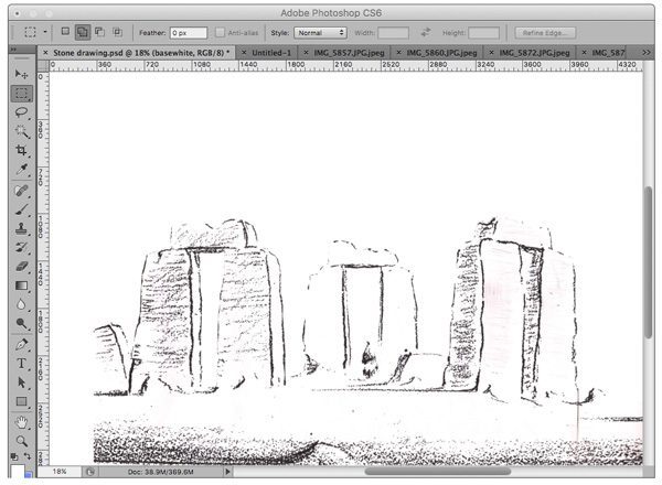
The image here is the original Watson sketch, imported into Photoshop. Though the sketch is anything but detailed, I can see where Robert was going with this idea, and appreciate his unique perspective.

01/15/2019

Step 2
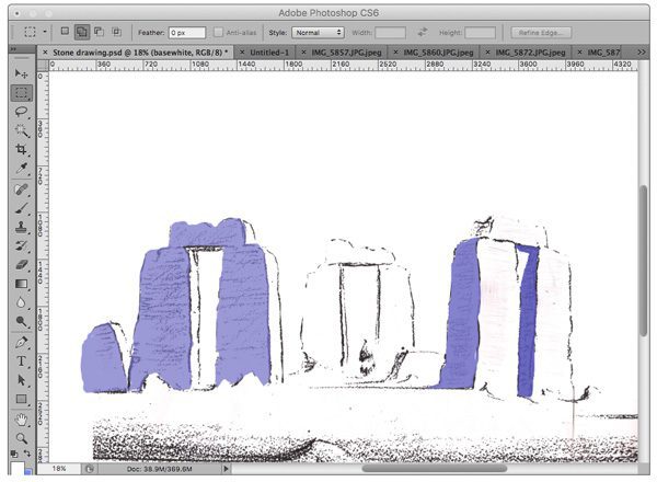
The original sketch details the location of shadow areas (shown in purple), which in turn revealed an unusual light location; Its placement is very low and to the right, but in-between the front and back pillars.

This allows the face of the rear structure to be illuminated while the foreground ones remain largely shadowed. It creates sharp, contrasting areas of light and shadow. Though not the largest structure, the farthest one becomes the focal one. In addition, it opens up an area of focus in front of that structure, which I will use to create more depth and interest. Robert was brilliant at this.

I actually used small white boxes and a desk lamp to study the way the surfaces would catch the light at different angles. This helped me to decide on the color densities for the different pillars. I don’t want to work with opaque colors for quite awhile on this piece, so I will begin with layers of faintly colored glazes. Varying the number and colors of the glazes will (hopefully) produce the densities needed to make this work.

01/15/2019

Step 3
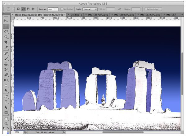
Finally, this particular painting is going to have a simple, dark sky with few clouds, so I did a quick background blend from light to dark to represent the oils. This little image now gives me something to refer to as I work through this project.

All of this is a kind of “grounding” process to keep me focused on the idea that started this. Robert’s idea.

This is gonna be fun!

01/15/2019

Step 4
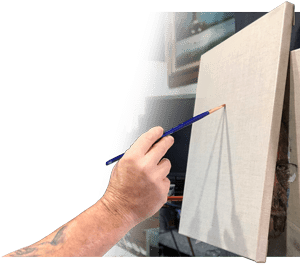
Now that the rough layout is complete, I transfer the image to my canvas by sketching it out with a charcoal pencil. Once the image is sketched, I go back with a wet cloth and wipe the canvas down. This removes any loose charcoal and lightens the sketch dramatically. I am not going to use any clear gesso over the drawing to seal it, so I cannot have any loose charcoal getting into the oils.

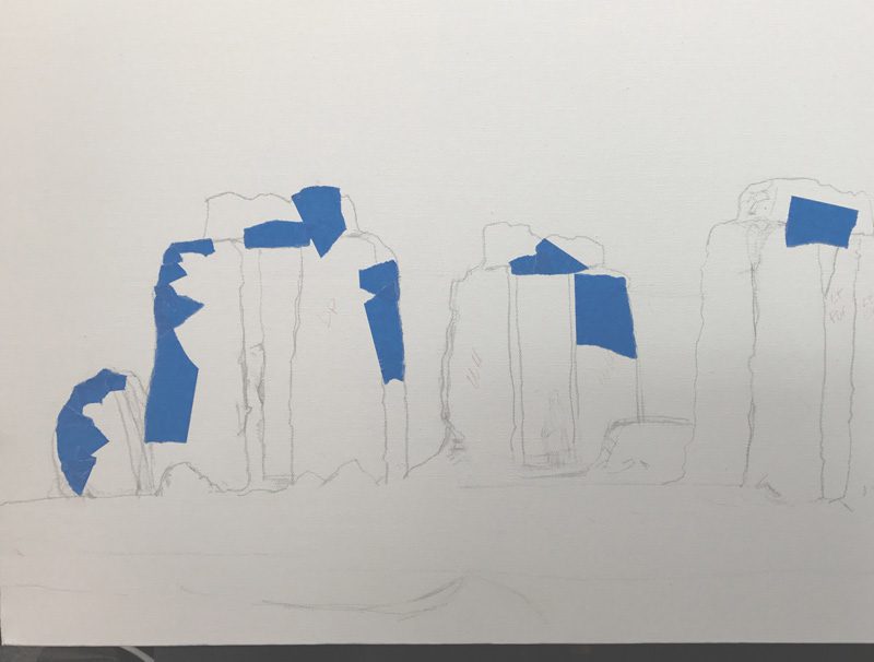
With this particular project, I want to mask out the “stone” structures so I can paint the sky without staining the white canvas. I just tear pieces of masking tape off a roll and find the place where it most closely  fits the shape I have drawn. This is rather tedious, but it is a huge timesaver in the long run.

01/15/2019


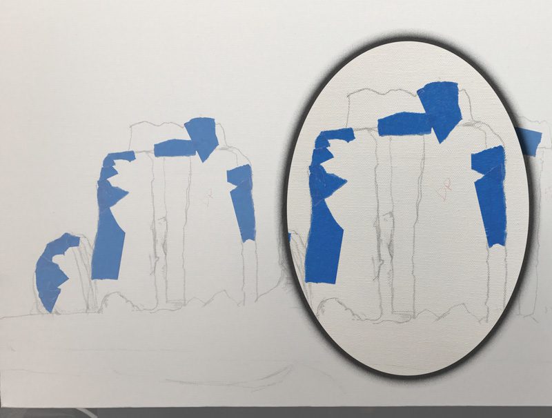
A close-up of the process. Lots of little pieces of tape scattered all over.

01/15/2019

Step 5
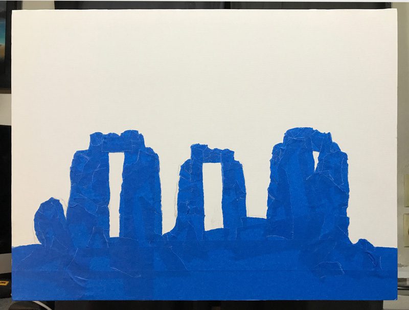
This shows the masking once completed. Now I can go wild blending the background without having to worry about preserving any edge detail. It is much quicker this way, and produces consistent blends across the entire canvas.

brushwhite-thinH

••• Painting with Oils •••

brush-white-wideH

01/15/2019

Day One of Oils
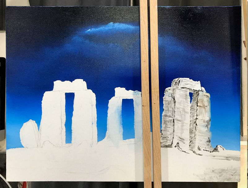
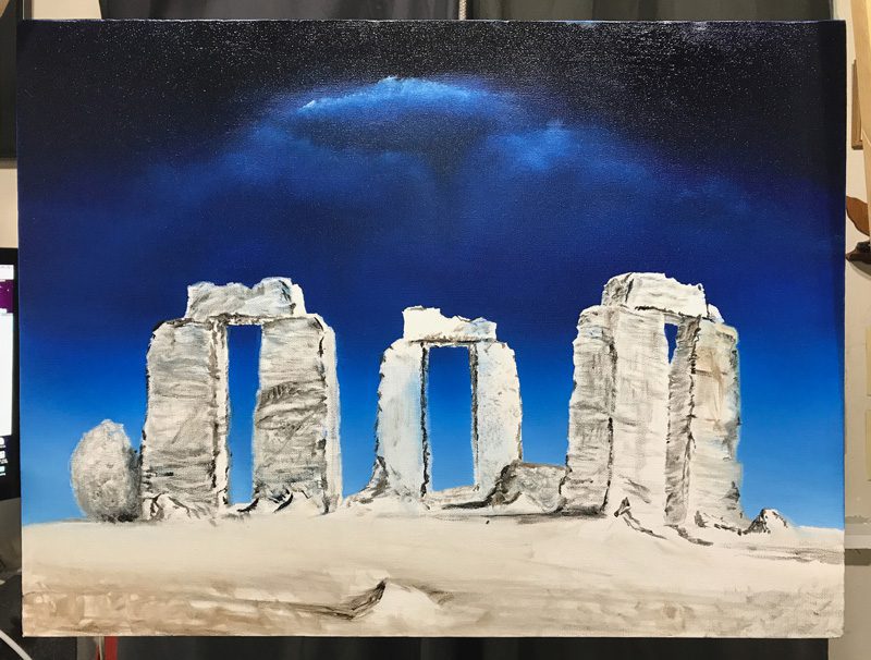
Once the sky has been added, I remove the tape and go over the edges with a soft blending brush to remove any hard lines. 

Then I begin sketching out details with a semi-dry brush. These can be left visible through the paint glazes if I so choose, or just used to guide me along. We’ll make those decisions as we go along. 

01/15/2019

Here is the completed dry-brush detailing. 

Just this bit of rough detailing makes it much easier for you to proceed.

We’ll see how much of it remains visible as we go forward, but either way it provides a “roadmap” for the overall concept.

01/15/2019

Session Three
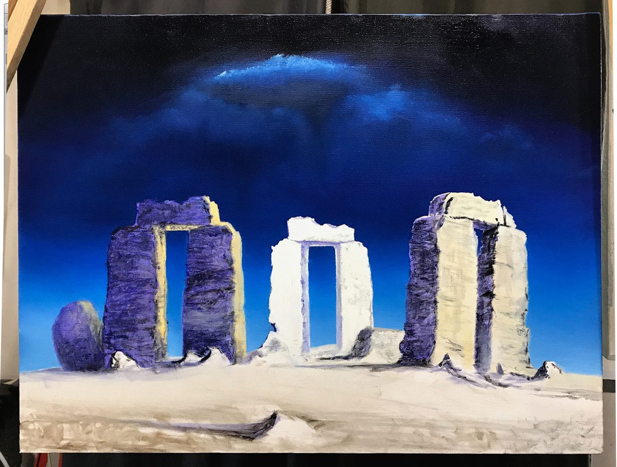
I’ve added the first few purple and tan glazes to the stone pillars in the foreground. I will do some lighter glazes next, to reduce the overall color saturation so it is not so intense. The focus needs to be on the center structure, so I must keep soft edges and details in mind for these objects in front.

The glazes are mostly done with Liquin or some other medium, which can shorten the drying time immensly. However, there is still a time consideration as the medium sets up. Working it again too soon will pickup pigment, or mottle everything, so patience is required here.

To keep things moving, I did the darker areas first, then worked on lighter areas. I alternated back and forth, which gave each area some drying time while I worked on the other. Always have enough brushes handy so you can work your light and dark colors with separate brushes

01/15/2019

Session Four
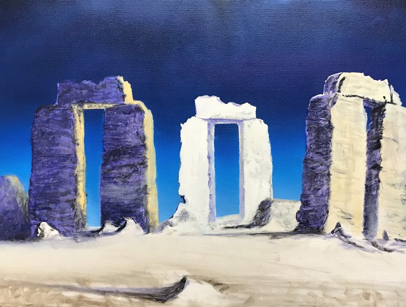
I know it’s kinda hard to tell, but the first few light glazes have toned down the previous colors, and softened the detail. 

I’ll keep at it a bit longer, and then let it dry. The next few steps after that will probably begin to drive the final color direction from here.

01/15/2019

Session Five
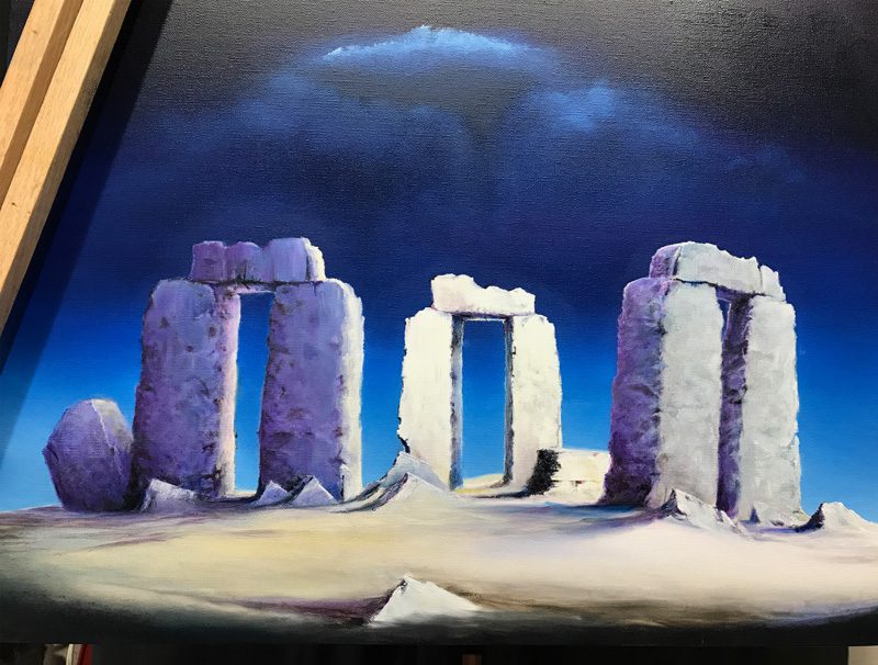
I have added several glazes along with some opaque areas to the stones. I’ve also shifted to a blue-gray-ish shade for the light areas of the structure on the right. The really cool thing about glazes is that you can still see most of the different colors underneath – so the yellows from the previous step still show in areas, along with colors from all the previous steps. I think this helps to build richer colors, providing places for your eyes to explore.

I’ve also begun working the foreground toward the final color scheme. The purples and blues on the right side will likely dominate, and the yellows on the left will drop beneath light glazes that bring in some earth tones. As for what comes in-between… Lord only knows!


The final piece has been added to the Gallery section. Let me know what you think!

See you again soon…

David signature 250x118 1

© Copyright 1996-2024 – David Fedeli Fine Art • All rights reserved

© 1996-2024 – David Fedeli Fine Art • All rights reserved